Hi! I’m back with a supplement to a piece in the New York Times’ Street Wars series, which is all about the battle for navigable urban space in New York City. In this article, I’ll go more in-depth about how I devised & computed the claustrophobic metric. We plan to explore this metric further through an in-progress research paper; keep an eye out for that later this year! Let’s begin.
New York City is a large place; almost 469 square miles of pretty dense civilization. Within the city, there are thousands of miles of sidewalks. As you walk through different neighborhoods, you may experience a variety of different atmospheres. In Cobble Hill, Brooklyn, it’s quaint and quiet. In SoHo these days, there are so many pedestrians that they spill off the narrow sidewalks. While a neighborhood’s atmosphere is, of course, a function of time, it is possible to get an average consensus of how ‘crowded’ each neighborhood feels by averaging over time. When we say ‘crowded’, we mean not just with people; we also mean with static objects, or street furniture, or, to get even more colloquial, ‘clutter’. When we mix ‘crowdedness’ within the narrow environment of NYC’s sidewalks, we endeavor to call this feeling ‘claustrophobia’, a direct mapping to the definition in psychology.
Now, we’ll discuss how the metric of sidewalk ‘claustrophobia’ was calculated. Then, I’ll talk briefly about how this metric might be interesting and useful to a variety of different stakeholders.
Methodology - Segmentization
We start with the official planimetric database of NYC’s sidewalks from NYC OpenData at this link. However, the geometries for each sidewalk here are stored as multi-polygons, instead of at the per-segment level. Further, the geometry can be quite complicated, in fact, overly complex for the purposes of our analysis. To mitigate these problems, we perform the following:
-
Simplify geometry using Shapely library
- Here, we first simplify the sidewalk geometry to reduce some of the complexity in the street network. We visually inspect several different neighborhoods and find that this minimally changes the shape of the network while moderately reducing the number of points after segmentization.
-
Segmentize points along sidewalks at least every 50 feet.
- Then, we segmentize the simplified sidewalk network. Segmentization is a process that evenly samples points along each sidewalk, at a predetermined threshold. We use a threshold of 50 feet to balance computational complexity and storage constraints with accuracy.
Methodology - Bringing in Clutter
For this computational analysis, ‘clutter’ is anything that takes up space on the sidewalk. Narratively, some clutter is aesthetic or unminded by pedestrians (like trees, most seating); then, things like scaffolding are denotatively and connotatively ‘clutter’. To identify different types of clutter, I took walks around several different neighborhoods in Brooklyn, Queens, and Manhattan, writing down the different things that I saw. At this point, I tried to match each type of street furniture I saw with a dataset on NYC OpenData, which is a great, official portal that stores hundred of city-related datasets from dozens of city agencies like the Department of Transportation and NYC Parks. To save space, I list all of the datasets I used in next section’s table, along with an access link.
We assign points to different clutters with spatial joins. For each point, we add a buffer (think of this as a larger ring, centered at the point) of 25 feet. These buffers act as a net, ‘catching’ nearby pieces of clutter. Multiple points may count a piece of clutter as ‘theirs’ if the clutter is within both points’ buffer area.
Methodology - Weighting
We apply a weight to each clutter type based on its estimated size. I admit this is quite naive, and solely based on my ‘experience’ as a pedestrian. In the below table, we present the weight allotted to each clutter type.
Possible ways to refine this include conducting a survey, or actually taking into account the square footage of each clutter type. Since some clutters have non-uniform sizes (for example, there are several different configurations of bus stops, each with a different size), and size data was unavailable for some clutter types, we stick with the naive approach for now.
| Clutter Type | Weight | OpenData Link |
|---|---|---|
| Bus Stop Shelters | 2 | link |
| Trash Can | 0.5 | link |
| LinkNYC | 2 | link |
| CityBench | 1.5 | link |
| Bicycle Parking Shelter | 2 | link |
| Bicycle Rack | 1.5 | link |
| Tree | 0.15 | link |
| Newsstand | 3 | link |
| Parking Meter | 0.15 | link |
| Scaffolding | 2 | link |
| Fire Hydrant | 0.25 | link |
| Street Signs | 0.05 | link |
Methodology - Traffic
We derive our foot traffic estimates via large-scale, crowdsourced dashcam data provided by Nexar, Inc. Nexar is a company that manufactures dashcams and explores how downstream data can help make more useful and accurate maps. Of course, these images tell us nothing about pedestrians by themselves. We detect the number of pedestrians in each image via YOLOv7-E6E, a state-of-the-art object detection model with well-documented success in this task.
Dashcam data points are stored at the latitude/longitude level with a 0-360 ranged directional heading. So, in other words, if you were plotting each point on a map, you’d know exactly where to put it on the map, and you’d also know which direction to put an arrow facing outwards from the point. We then project the points from a Cartesian coordinate system to a NYC-specific projected coordinate system for increased accuracy. To combine the position and the heading, we further increase positional accuracy by creating ‘cones’ to represent the actual field-of-view of the vehicle at the time/place of capture.
With access to sidewalk width (in feet) from the basemap described earlier, we compute the number of pedestrians per foot of sidewalk width, at each image. This traffic data is sliced at one-hour increments (this is arbitrary), but our main plots don’t go to this granularity and instead converge at ‘a typical day of traffic’ in NYC in August 2023.
Limitations
This work is very exciting for us, but still has some unconquered limitations.
Missing Data Streams
First, there are several clutter types that we identified in our walks around the city, but couldn’t find matching datasets for. This includes, but is not limited to: - Sidewalk eating - Roadside eating - Street lights (could infer via 311 complaints, but haven’t yet done) - Red legacy FDNY alarm boxes - Cellars (not a problem unless open) - Sidewalk plant beds - USPS / Package drop-off containers - Streetside produce markets
Separately, for our dashcam-computed foot traffic counts, we are missing data for about 36.11% of the segmentized points in NYC. This isn’t a huge problem, as we aggregate data at much larger geographic groupings like Neighborhood Tabulation Areas and Census Tracts. Nonetheless, it would be more ideal to use a dataset with more complete coverage of the city. The more temporally and geographically dense data we have, the more we can ‘zoom’ in.
Imprecise Data Streams
In addition to missing data streams, we also use some that are notably imprecise.
For example, New York City’s sidewalk scaffolding is logged at the building permit level, so we compute a radial 150-foot outward buffer to capture all nearby points; in reality, only part of a building’s perimeter will actually have the scaffolding.
Other imprecision comes from “old” data; for most of the clutter types, we’re able to filter by construction date, meaning that clutters built after the end of our traffic data aren’t included. However, this isn’t possible for all clutter types (we look at this more closely in the “clutter.ipynb” notebook on the claustrophobic-streets GitHub repository).
Results
Let’s start with some spatial visualizations. Below, we map our calculated levels of claustrophobia at the Neighborhood Tabulation Area (NTA) level. NTAs are roughly approximate to New Yorkers’ mental maps of neighborhoods. Some interesting trends emerge that made sense at first glance, at least for me! Namely, most of Midtown Manhattan sees the highest ‘claustrophobia’ levels. This aligns with my anecdotal experience of trudging through crowds in and around Times Square that were quite literally stationary for 15 seconds at a time. However, at this small granularity, we can’t really see where other hotspots emerge clearly, at least from the map’s coloring. Let’s try zooming in.
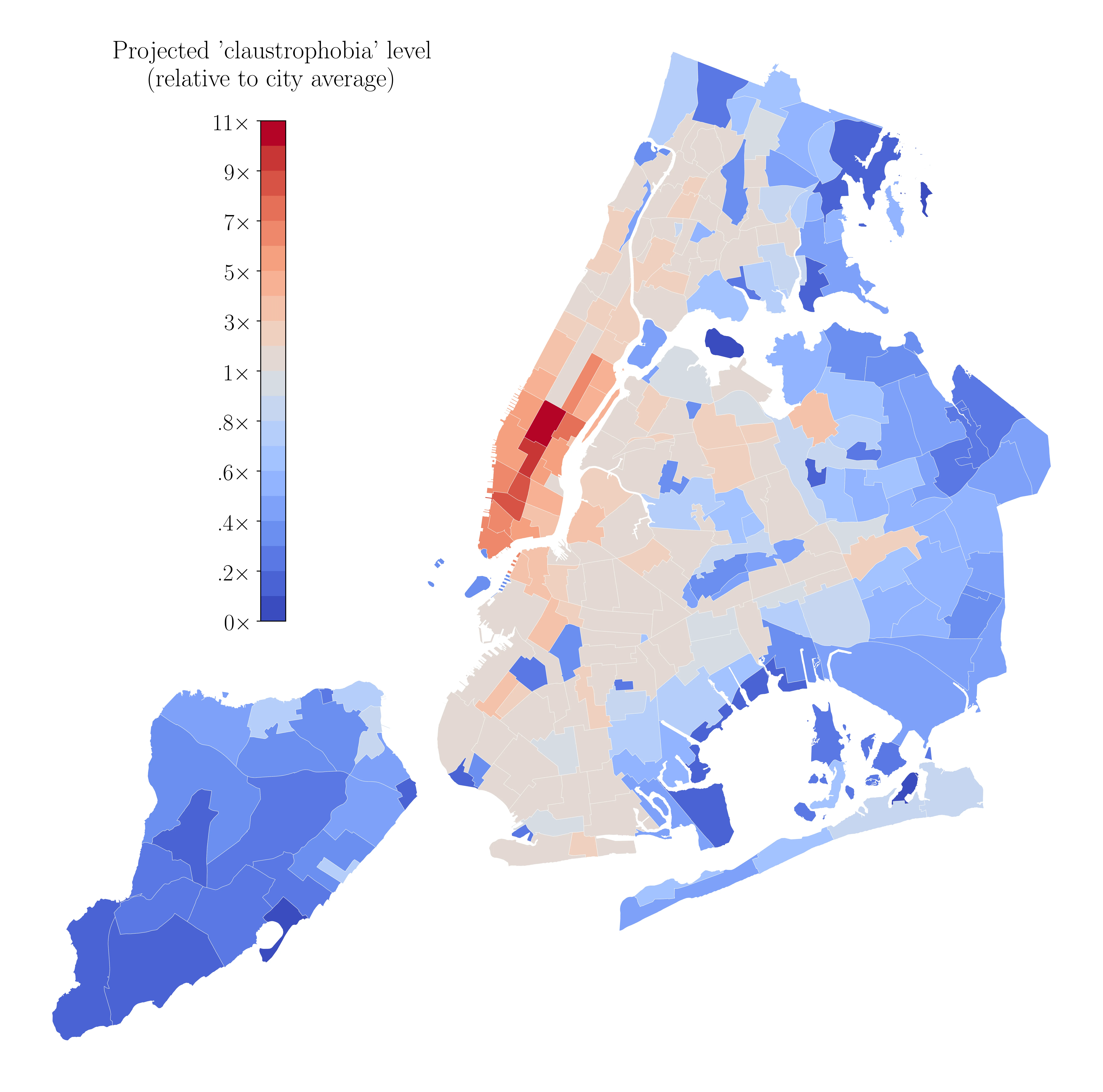
Now, we map our calculated levels of claustrophobia at the Census Tract (CT) level. CTs are much smaller; in 2020, NYC was composed of 2,327 of them. Here, more interesting visual trends emerge. I see areas in Queens colored in red that I remember being extremely crowded when I visited; including Jackson Heights (near LaGuardia Airport) and Flushing (much further out in Queens, at the end of the 7 train). Downtown Brooklyn and Williamsburg also see notably higher-than-average levels of claustrophobia, which lines up with my own experiences. For both maps, Staten Island tends to be colored entirely in blue, meaning lower-than-average claustrophobia; I’ve still not taken the ferry over, so I won’t make any definitive claims, but this at least aligns with the borough’s higher usage of cars, relative to the rest of the city.

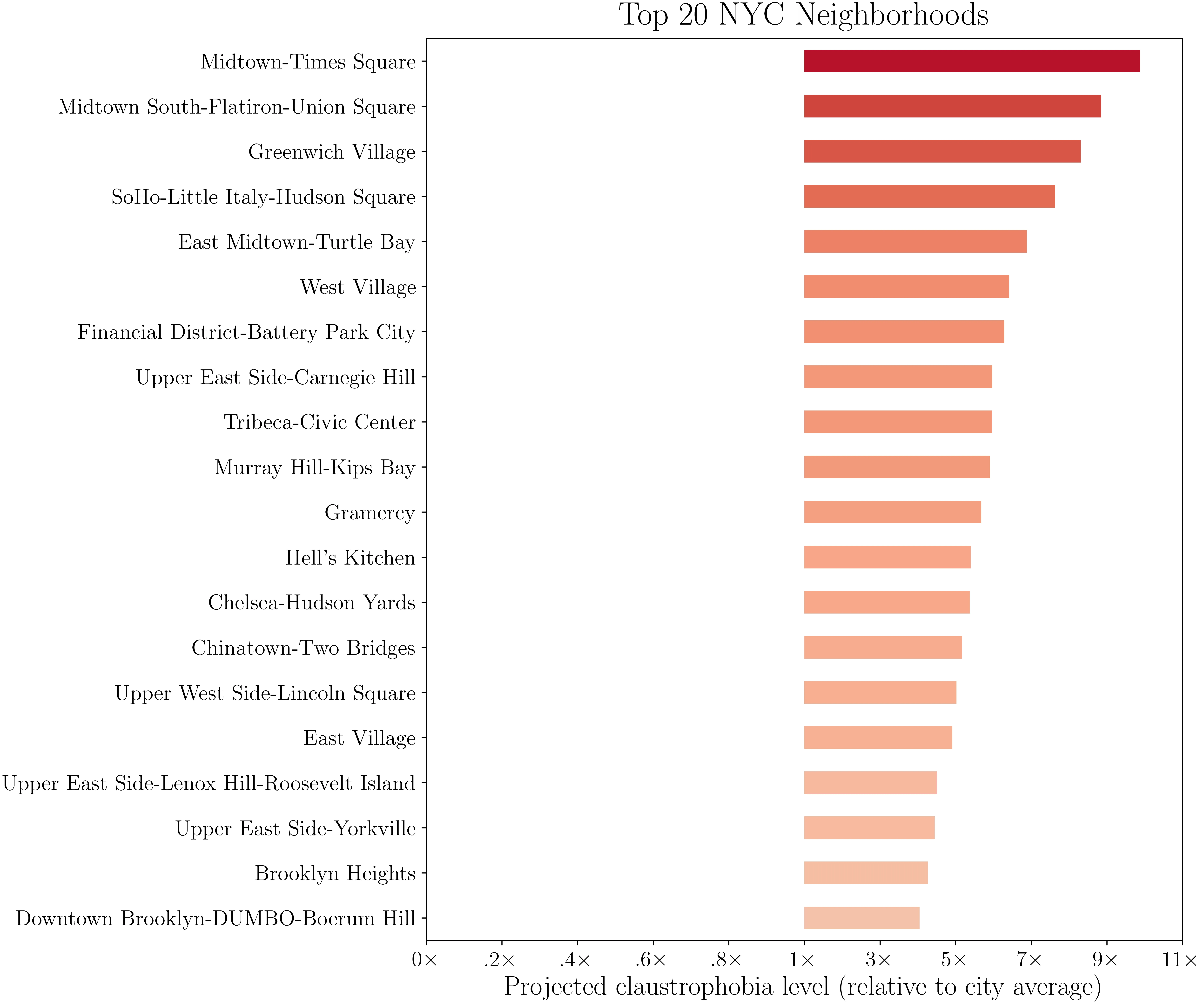
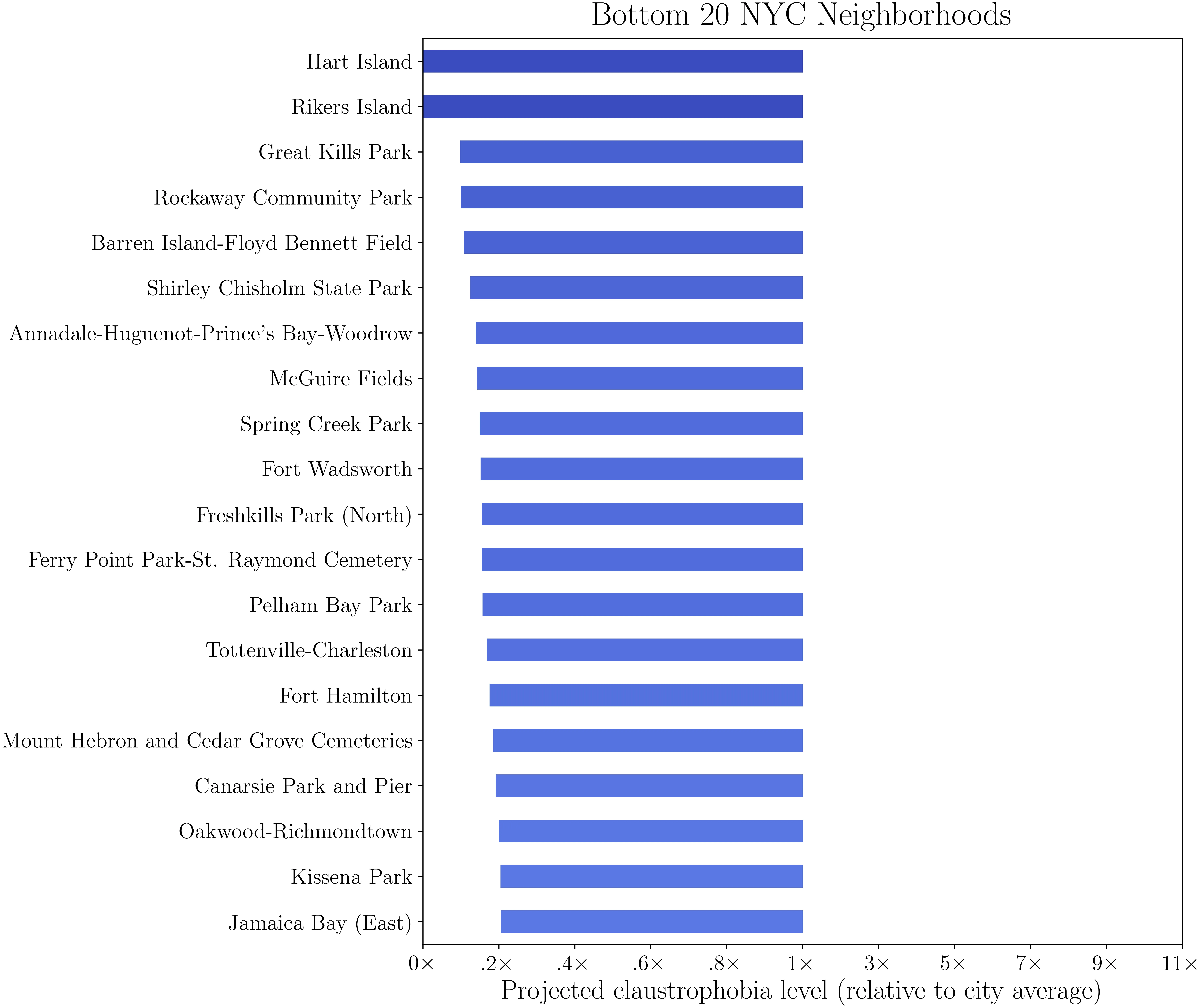
Lastly, for name recognition, we plot the top 20 and bottom 20 neighborhoods, relative to the city average. See if your neighborhood pops up in either list!
For some additional plots, including zoom-ins of each borough, and density maps of foot traffic and street clutter, check out the GitHub repository for this project at github.com/mattwfranchi/claustrophobic-streets. If you have any suggestions or questions, feel free to email me at mwf62 AT cornell.edu, or open an issue on the GitHub repository. Thanks for reading!